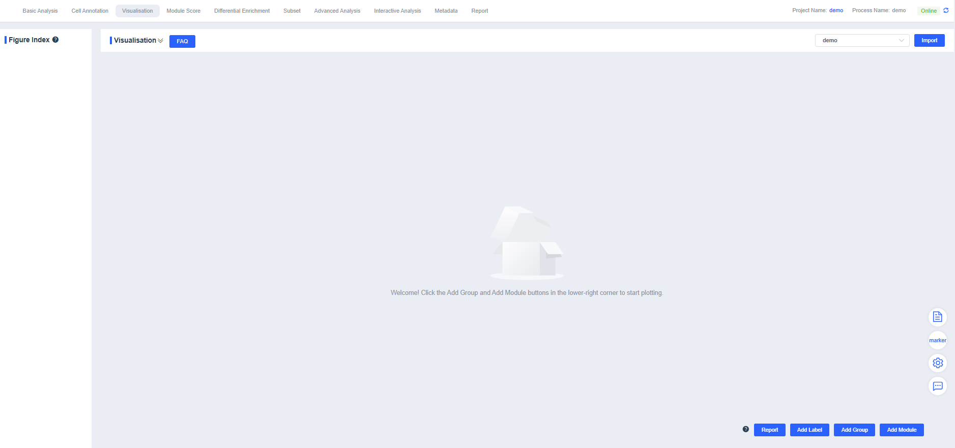
Visualisation
The “Visualisation” lets you add multi-condition labels and generate a variety of charts, including violin plots, dimensionality reduction plots, FeaturePlots, DotPlots, stacked bar charts, and pie charts. Whether you showcase the expression patterns of specific genes or cell types or explore data distributions, these visualizations provide intuitive insights that support deeper analysis and interpretation.
NOTE
The “Visualisation” supports multiple mainstream visualization types. Choose the chart that best matches your analysis objective.
Download Report
Click Report to export all charts from the “Visualisation” as a report to your local computer. The download may take about 30 seconds.
Add Labels
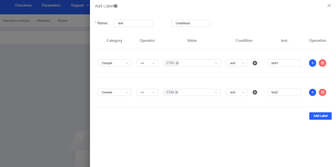
Click Add Label to open the labeling dialog and tag barcodes based on your conditions.
- Enter a name for the new label in Name.
- Operator offers equals (==) and not equals (≠), while Condition provides intersection (and) and union (or). Combine operators and conditions to pinpoint critical cell populations with multiple criteria.
- Barcodes that do not meet the conditions are labeled Undefined by default, but you can customize the label.
- Click Add Label to save. The new label is then available for plotting within the “Visualisation”
Add Groups
Manual Addition
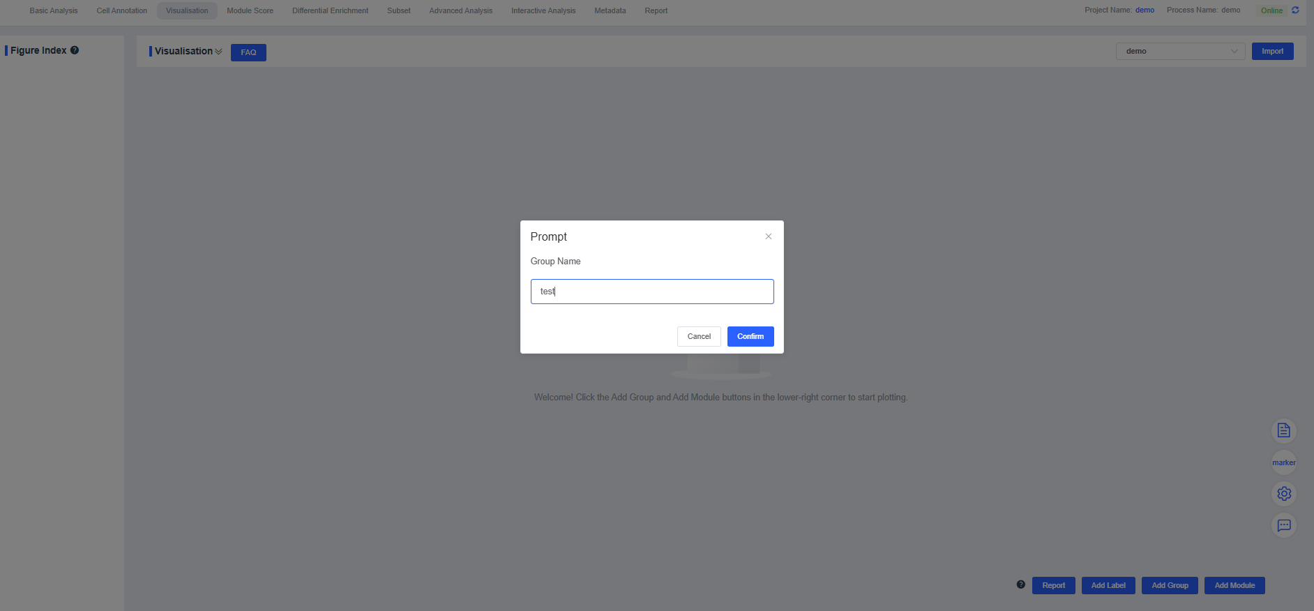
Click Add Group, enter a name in the dialog box, and press Confirm. The new group appears in the “Visualisation”
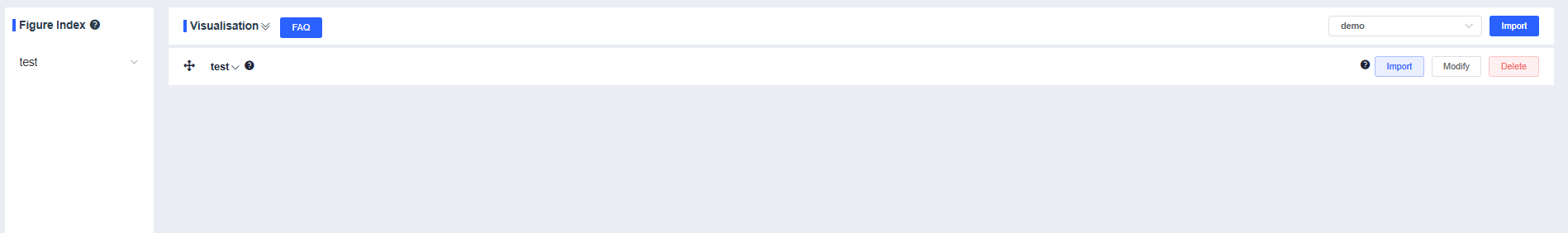
Press and drag the crosshair vertically to adjust the group order.
Use the dropdown to the right of the group name to expand or collapse the results. When collapsed, press and drag the crosshair to reorder groups.
Click Modify to rename the group. Enter the new name and press Confirm.
Click Delete to remove the current group.
Add Modules
Color Palettes
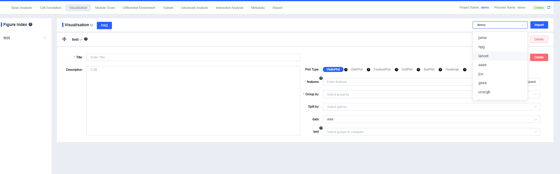
Click the SeekOne Recommendation dropdown to choose among palettes such as npg, lancet, aaas, jco, gsea, ucscgb, igv, and the SeekOne recommendation within the plotting module.
Add Modules
Click Add Module, enter a chart title in Title, describe the chart in Description, and select the desired chart type (violin plot, dimensionality reduction plot, FeaturePlot, DotPlot, or grouped statistics) to generate visualizations.
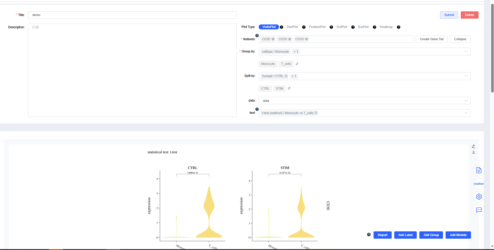
Violin Plot
Generate gene expression violin plots by group.
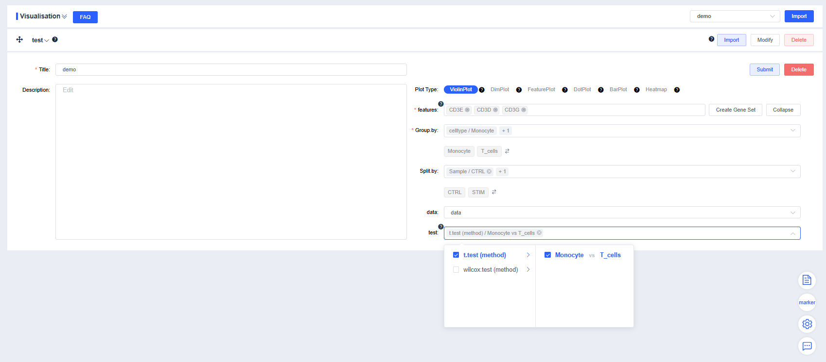
features: Enter the genes to plot. Use the dropdown’s fuzzy search to select genes; multiple entries are allowed. Click Create Gene Set to open a dialog, provide a name, and press Confirm to create the set. Enter a gene set name to search and quickly visualize the set. Click Expand to view all genes and Collapse to hide them.
Group by: Choose a categorical label from
meta.dataor a newly added label from Add Label to color cells by group (required). Sub-level tags let you display only selected groups.Split by: Select a categorical label from
meta.dataor a newly added label to split the chart into subplots (optional). Sub-level tags can limit the displayed groups. Use the arrows beside the grouping and splitting factors to reorder them quickly.data: Choose the data slot whose expression values you want to visualize; the default is
data.test: When multiple groups exist, mark pairwise comparisons with p-values (optional). Sub-level tags can focus on selected group comparisons.
Configure the plotting parameters as needed and click Submit to render the violin plot.
Click Delete to remove the current violin plot.
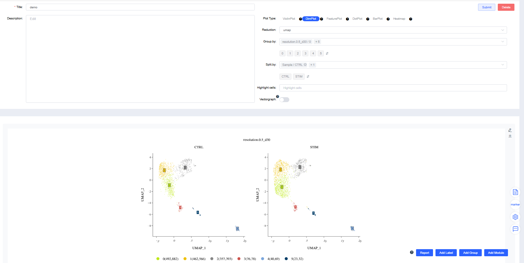
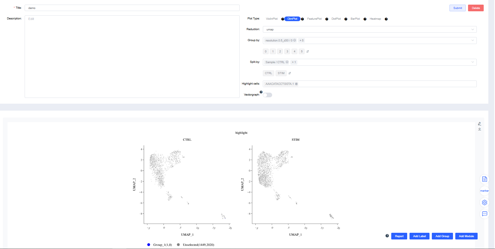
Dimensionality Reduction Plot
Render dimensionality reduction plots by group or sample splits.
Reduction: Choose UMAP, t-SNE.
Group by: Select a categorical label from
meta.dataor a newly added label to color cells by group (required). Sub-level tags let you display only selected groups.Split by: Select a categorical label from
meta.dataor a newly added label to split the chart into subplots (optional). Sub-level tags can limit the displayed groups.Highlight cells: Enter barcodes of interest to highlight them (optional).
Standard dimensionality reduction plots:
Highlighted-cell dimensionality reduction plots:
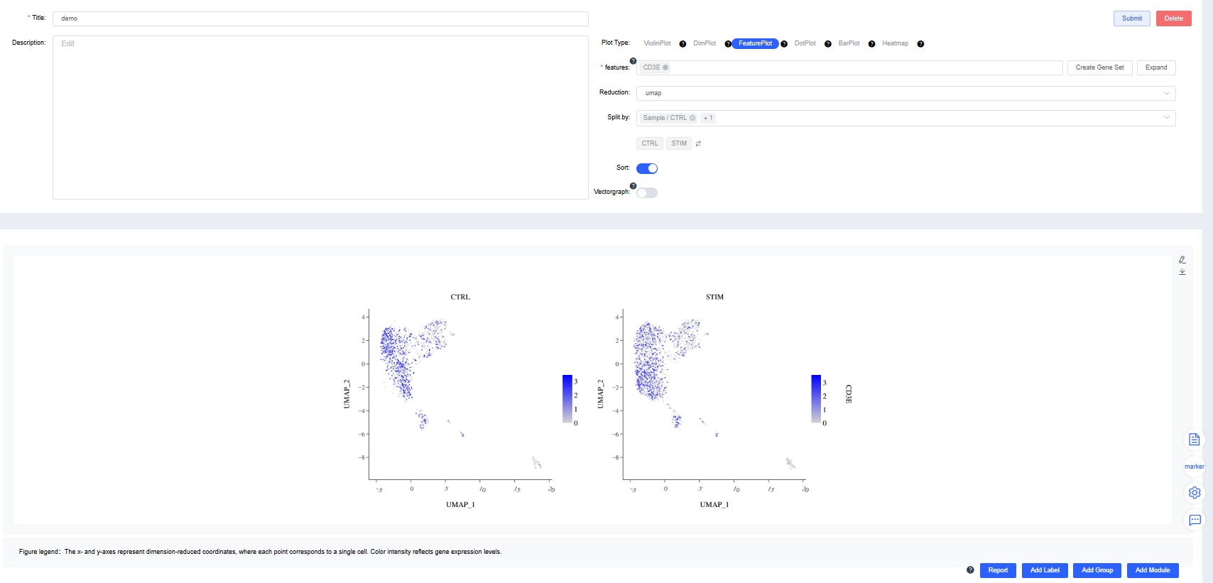
FeaturePlot
Create FeaturePlots of gene expression by group.
features: Enter the genes to plot. Use the dropdown’s fuzzy search to select genes; multiple entries are allowed. Click Create Gene Set, name it, and press Confirm. Search for a gene set name to visualize it quickly. Click Expand to view all genes and Collapse to hide them.
Reduction: Choose UMAP, t-SNE.
Split by: Choose a categorical label from
meta.dataor a newly added label to split the chart into subplots (optional). Sub-level tags can limit the displayed groups.Sort: Decide whether to draw cells in the order of expression values. The default is to sort by expression.
DotPlot
Create gene expression DotPlots by group.
features: Enter the genes to plot. Use the dropdown’s fuzzy search to select genes; multiple entries are allowed. Click Create Gene Set, name it, and press Confirm. Search for a gene set name to visualize it quickly. Click Expand to view all genes and Collapse to hide them.
Group by: Choose a categorical label from
meta.dataor a newly added label to group cells (required). Sub-level tags let you display only selected groups.Split by: Choose a categorical label from
meta.dataor a newly added label to split the DotPlot within the same figure (optional). Sub-level tags can limit the displayed groups.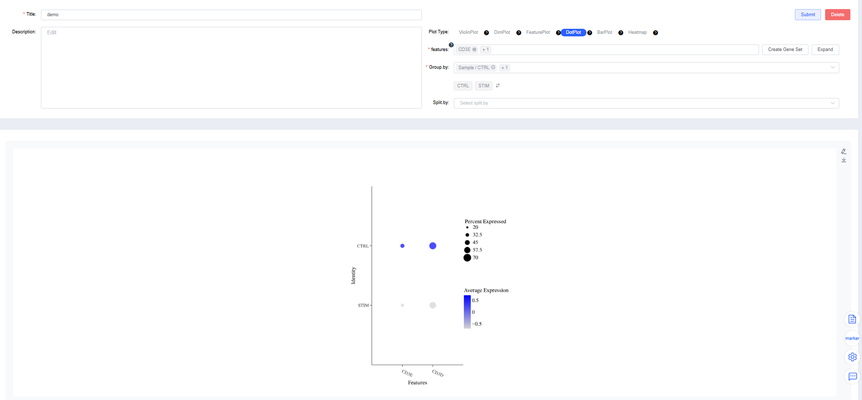
BarPlot
Stacked Bar Plot
Group by: Select a categorical label from
meta.dataor a newly added label to color cells by group (required). Sub-level tags let you display only selected groups.Split by: Select a categorical label from
meta.dataor a newly added label to split the chart into subplots (optional). Sub-level tags can limit the displayed groups.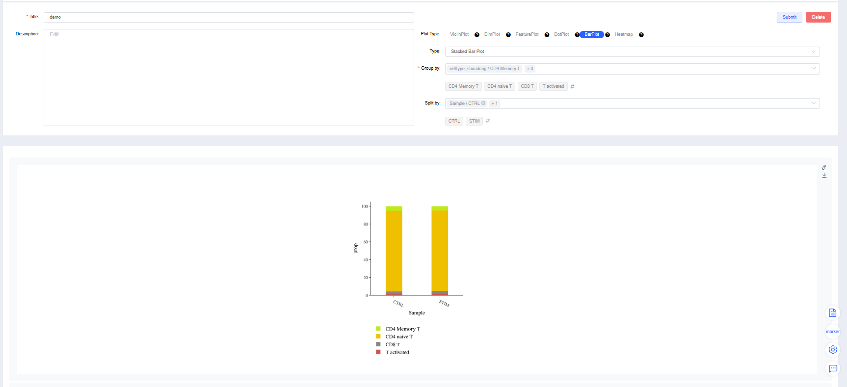
Pie Chart
Group by: Select a categorical label from
meta.dataor a newly added label to color cells by group (required). Sub-level tags let you display only selected groups.Split by: Select a categorical label from
meta.dataor a newly added label to split the chart into subplots (optional). Sub-level tags can limit the displayed groups.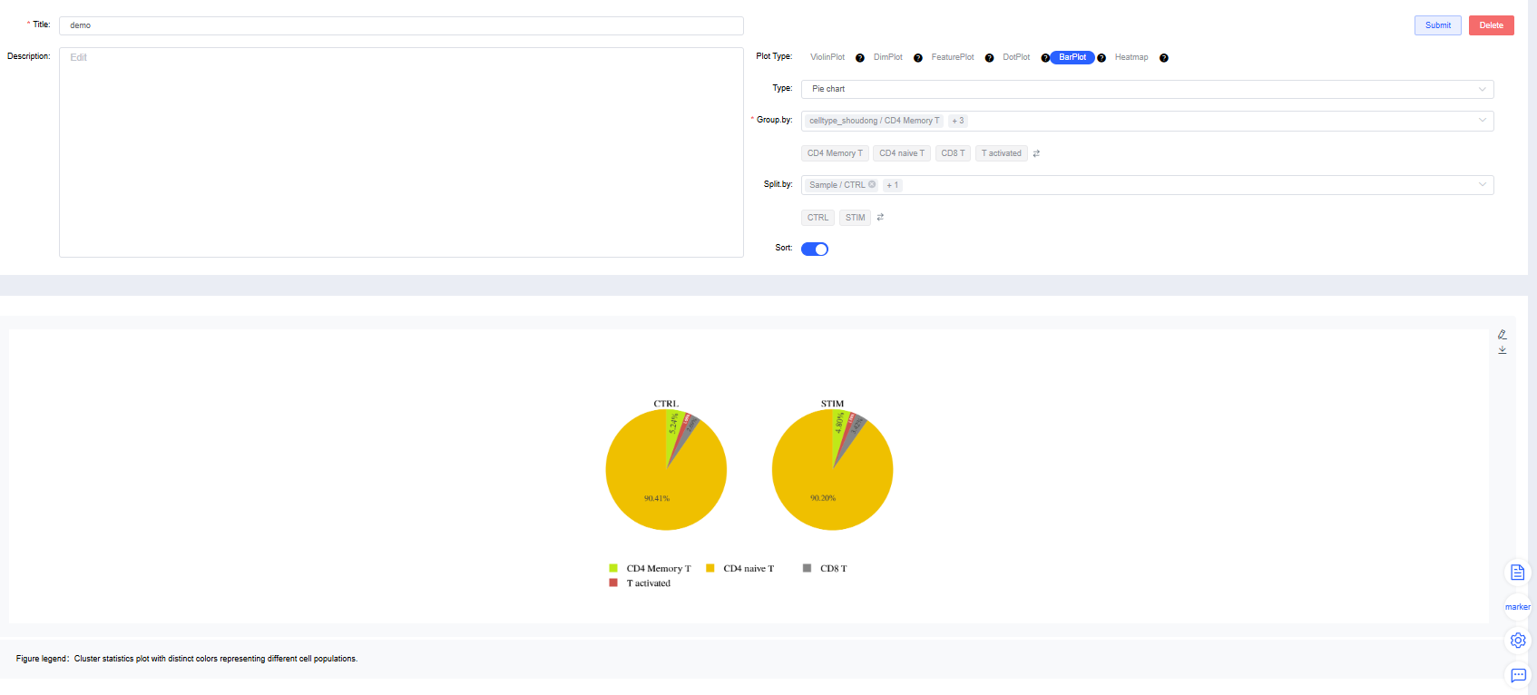
Heatmap
features: Enter the genes to plot. Use the dropdown’s fuzzy search to select genes; multiple entries are allowed. Click Create Gene Set, name it, and press Confirm. Search for a gene set name to visualize it quickly. Click Expand to view all genes and Collapse to hide them.
Group by: Choose a categorical label from
meta.dataor a newly added label to group cells (required). Sub-level tags let you display only selected groups.Split by: Choose a categorical label from
meta.dataor a newly added label to split the chart into subplots (optional). Sub-level tags can limit the displayed groups.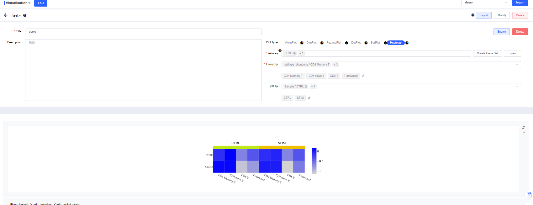
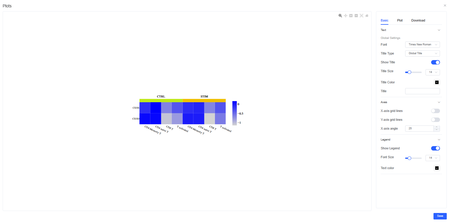
Figure Refinement
Click the pencil icon to the right of a figure to open the refinement panel. You can adjust titles, legends, figure size, and colors, and download images in multiple formats.
TIP
Use labels, grouping, and splitting factors strategically to combine visualizations flexibly and accelerate data interpretation.